ClimateWorks Foundation

Charting a shared map for a food-climate philanthropy ecosystem

[ Type ]
Radial dot map of the food-climate funding ecosystem with dot-grid lever legend showing 7 categories totaling 85 to 59 tactics each.

Context

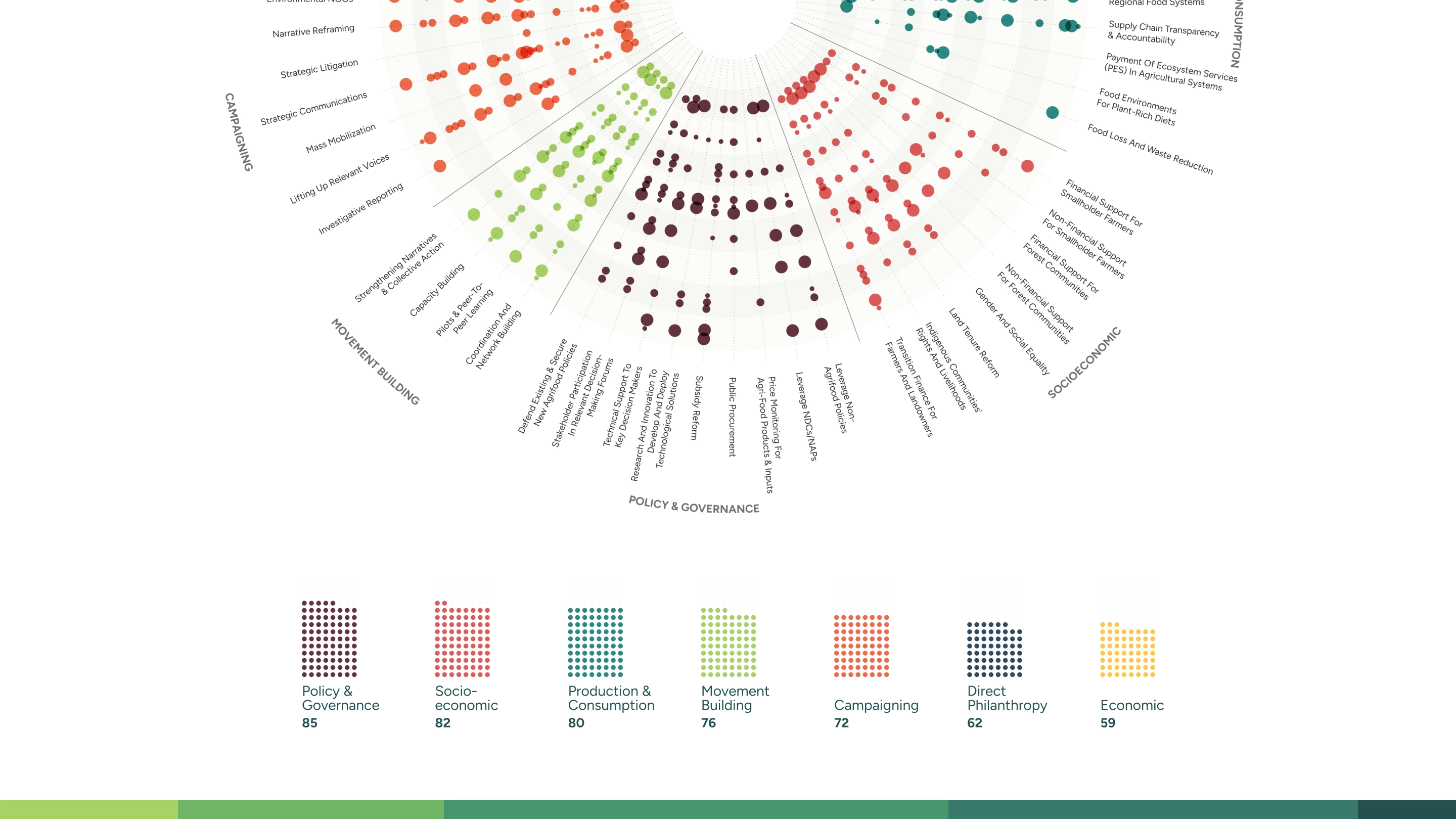
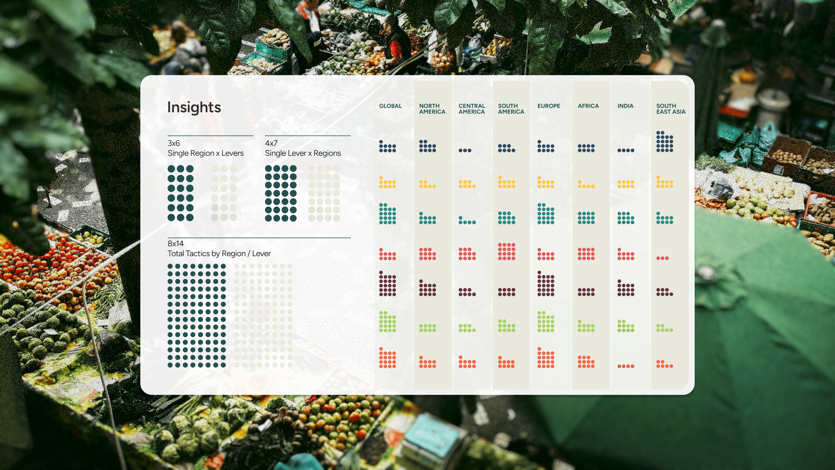
The food-climate philanthropy field has grown quickly. And   a shared map. Fourteen intermediary organizations were each funding transformative work in their corner of the landscape: their own theory of change, their own terminology, their own geographic logic. And no one could see the whole. Ask any of them to be placed in a category, and they'd tell you their work was too nuanced for that. They weren't wrong. But that's exactly what made the map worth building.

See the Project
Collage of different charts in the style of Moody's.
Four white cards on a wheat background previewing Europe and socioeconomic radial maps, a region dot grid, and a geographic browser view.

Create

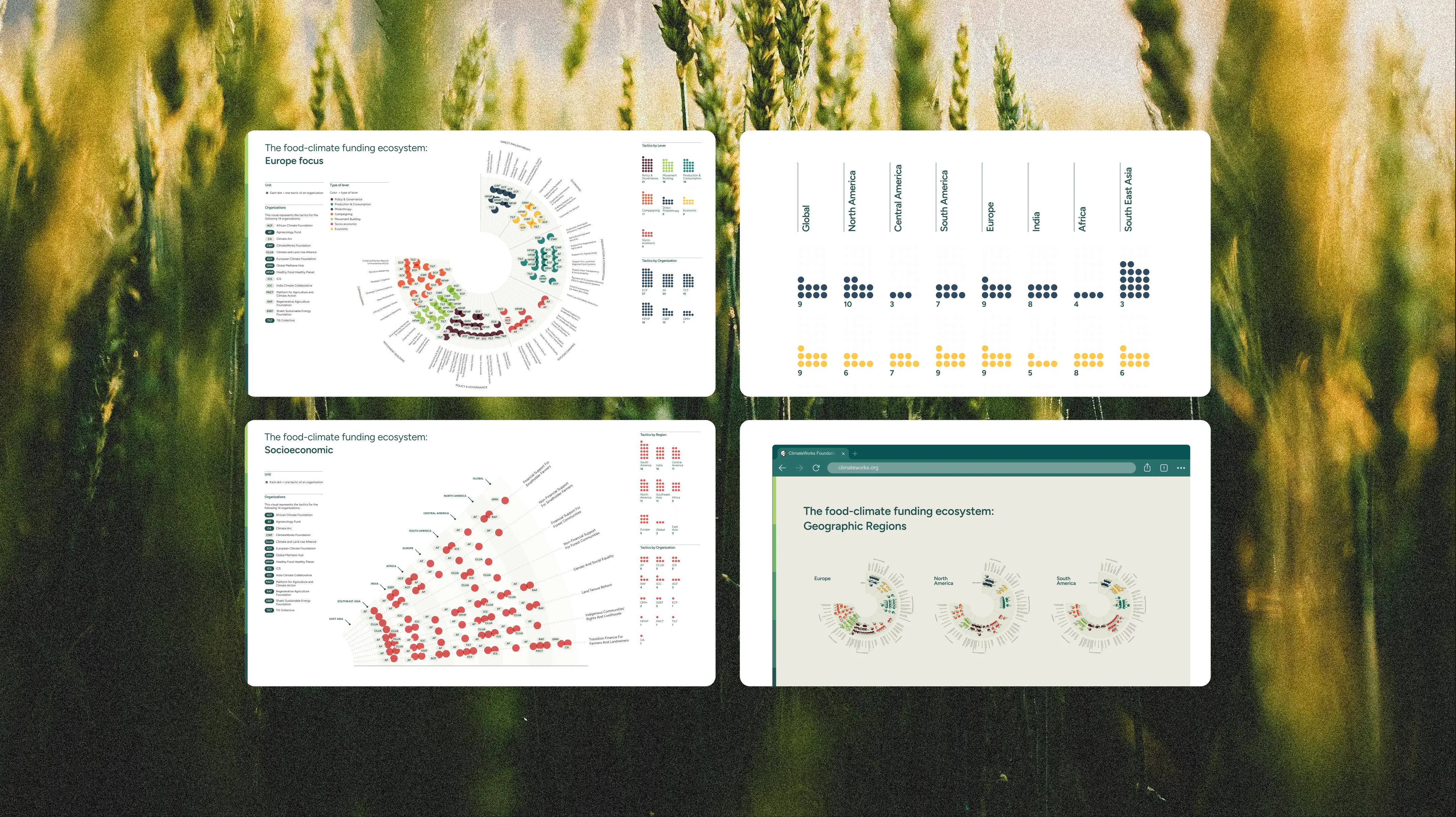
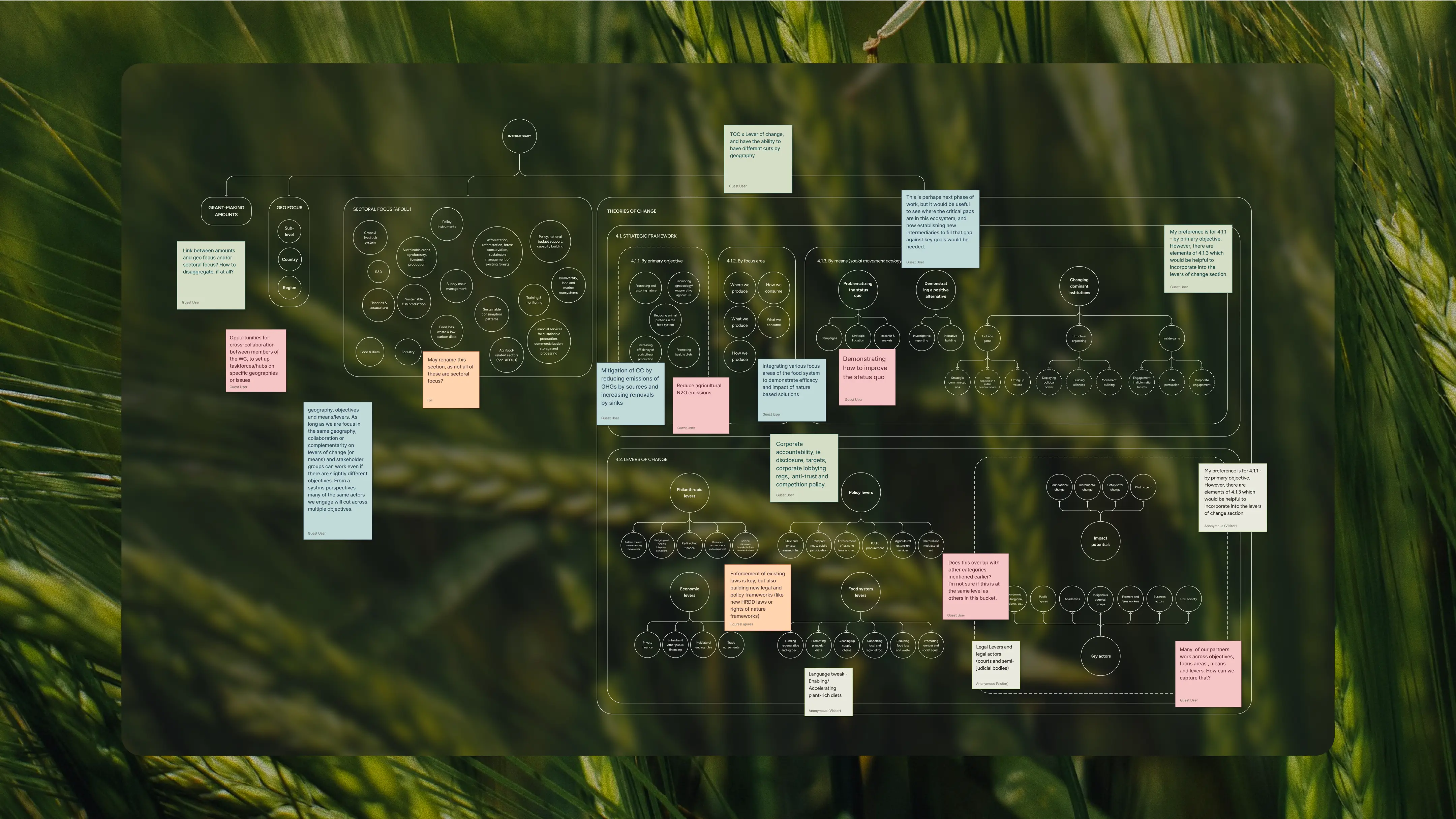
We embedded upstream, before the data was ready, to co-design the taxonomy and data structure alongside the research team. Then we ran a live working session with fifteen funders to stress-test the framework before a single visual was drawn.

  • Taxonomy design and validation: A two-axis strategic framework: sector (what organizations work on) versus means (how they create change). It collapsed a 100+ category system into four legible sectors and three modes, validated by funders live.
  • Data normalization infrastructure: A structured database with custom dependent logic for consistent tactic-level data entry across fourteen organizations. Budget comparisons were a particular puzzle: grant amounts couldn't be compared directly, so we sized each organization's dot by one of three budget ranges: up to $5M, $5–10M, or $10–50M+, to communicate scale without pretending to precision.
  • Ecosystem mapping visual: A dot-based diagram where each dot is one tactic, arranged by geography, colored by lever. For the first time, you could see concentration, distribution, and gaps across 48 tactics and eight levers in a single view.
  • Zoom views and coordination layer: Fifteen focused breakdowns, one per lever and one per geography, so any organization could find its corner of the map and see who else was working there. The overview showed the whole field. The zoom views made it specific enough to act on. A funder working on movement building in Africa could see exactly who else was there, at what scale, and through which tactics.

Layered taxonomy diagram with interconnected circles on a forest background, showing theories of change and levers with color-coded sticky note annotations.
Legend panel showing dot unit, 7 color-coded levers, 14 organization badges, funding circle-size key, geographic regions, and brand font Figtree.
Hands type on a MacBook displaying the ecosystem map with a hover card showing ClimateWorks Foundation, $10-50M funding, Direct Philanthropy lever.

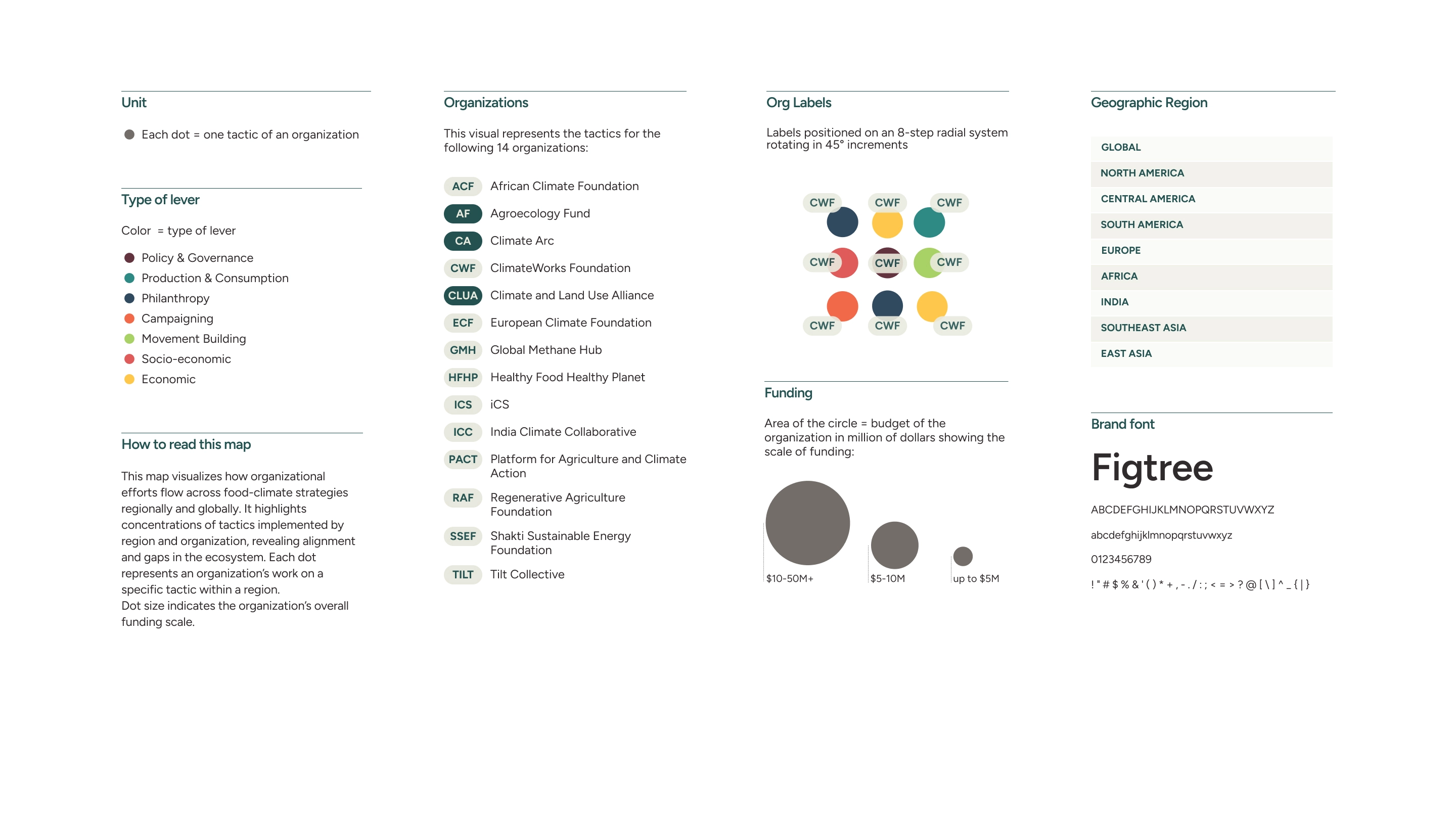
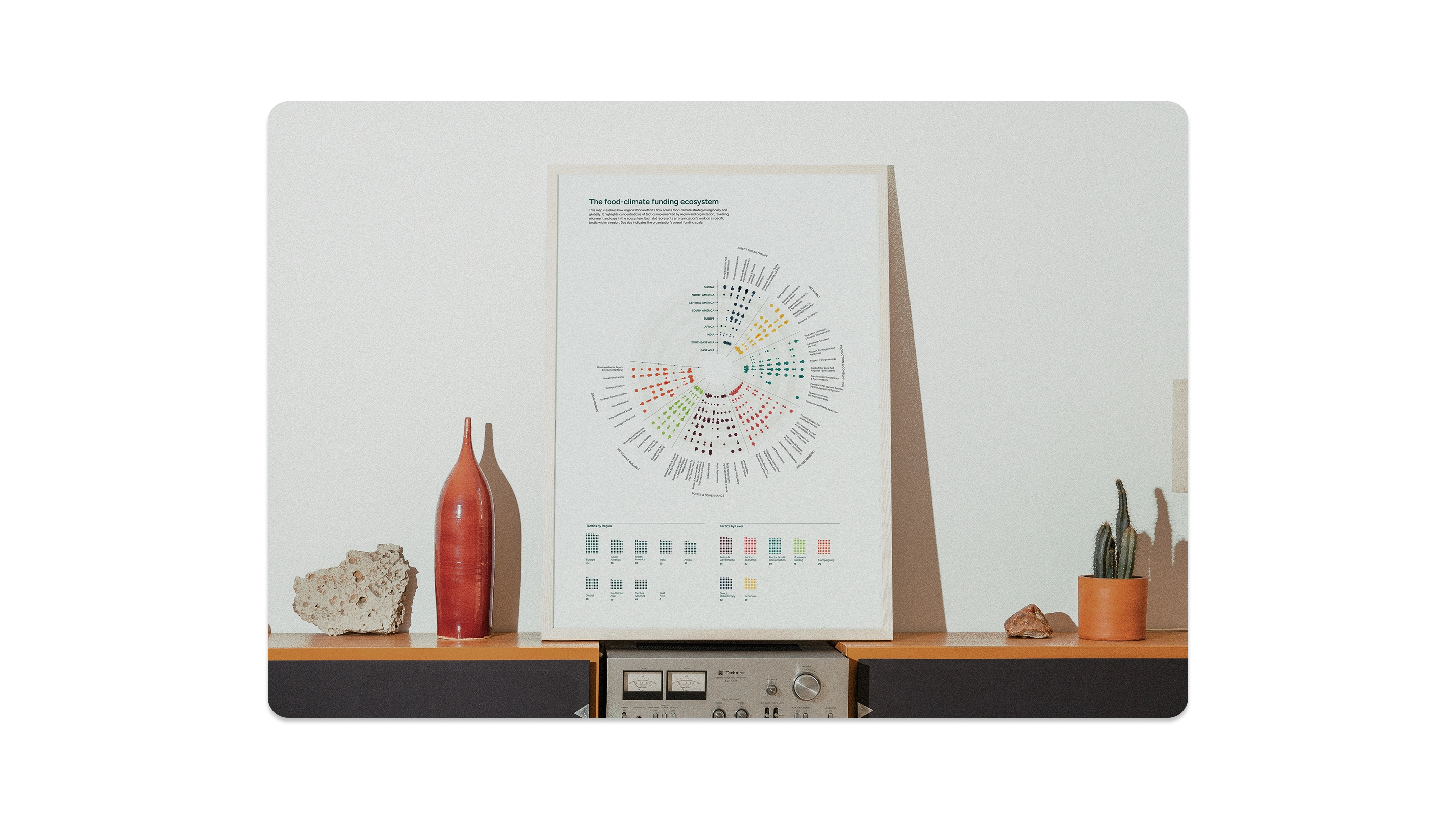
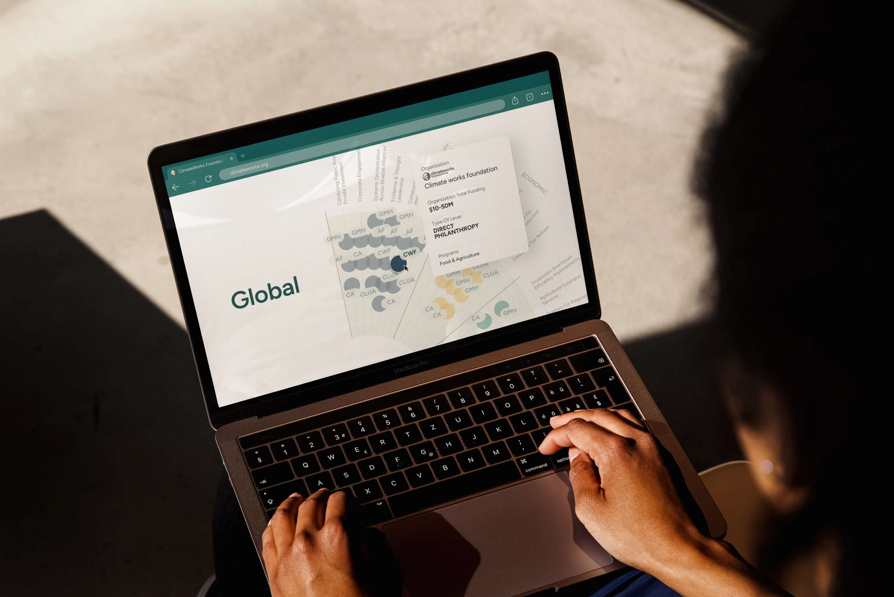
The mapping was presented to approximately twenty-five intermediary organizations at ClimateWorks Foundation's February 2026 convening. Organizations that had resisted categorization left with a framework they had helped build. ClimateWorks gained a coordination tool it can carry into ongoing field strategy conversations.

Impact

Dot-grid Insights table comparing tactic counts by lever across 8 regions including Global, Europe, Africa, and South East Asia.

Credits

Thanks so much to Thomas for the research partnership and to Patty for bringing us into the ClimateWorks network, and for trusting us to fairly represent the full range of what regranters do.

Strategy & Co-facilitation

Timour Screve

Research (ClimateWorks Foundation)

Thomas Legge

Visual Design

Daria Nikolaeva

Design Strategy & Creative Lead

Gabrielle Merite