Creative Direction
Gabrielle Merite
Data Visualization Design
Gabrielle Merite

In the battle against climate change, misinformation is the invisible enemy. Climate denial and greenwashing operate in shadows, systematically manipulating public opinion and policy.
PR firms and advertising agencies deploy sophisticated tactics borrowed from the tobacco industry playbook to delay action and maintain the status quo. For the average person, connecting these dots is nearly impossible.

.webp)

Christine Arena came to us with powerful research exposing how PR industry tactics systematically undermine climate progress. As founder of Generous Films and a trusted voice before U.S. Senate committees, she needed a visual language that could make these invisible mechanisms visible, transforming technical findings into compelling evidence that would drive accountability at the highest levels.
The visual identity centered on exposing hidden patterns of deception and delay through metaphorical visualization that balances emotional impact with analytical rigor.
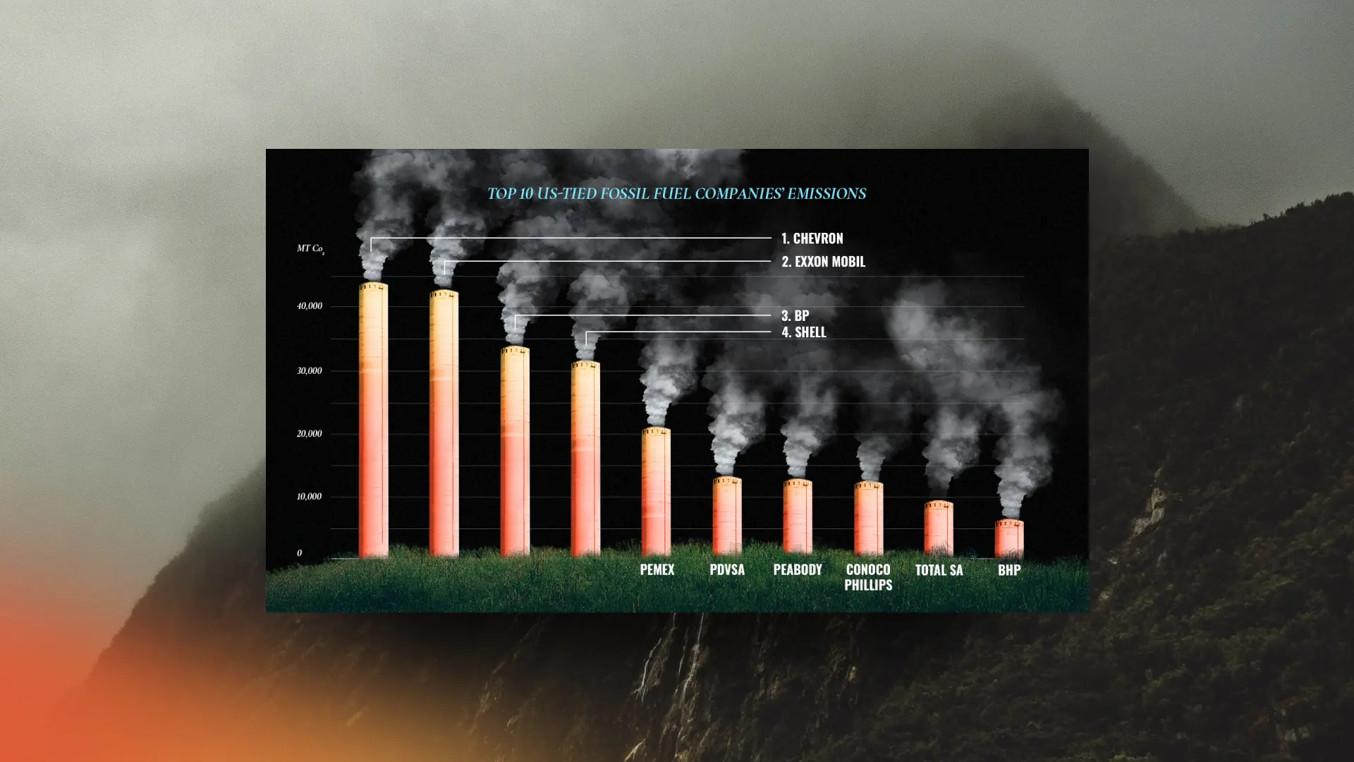
We created a visual system that turns abstract concepts into tangible revelations. Echo chambers ripple with misinformation. Autumn leaves reveal the subtle shades of greenwashing. Stark comparisons between tobacco and fossil fuel emissions expose parallel tactics of denial. Black and white photography establishes historical context, while electric neons highlight key patterns of deception.
The visual identity was applied to:

_V2.webp)


— Christine Arena, PR whistleblower
.webp)


Together, those assets support Christine's mission to drive accountability and change at the highest levels of government and industry.
Thank you so much for your trust Christine.
Creative Direction
Gabrielle Merite
Data Visualization Design
Gabrielle Merite