As part of the Infogr8 team, our transformation strategy centered on creating a more accessible, user-focused platform while maintaining the index's analytical rigor. Through comprehensive user testing, we identified critical areas for improvement in user comprehension and navigation. This testing revealed that not a single test user could execute all tasks correctly, highlighting the urgent need for a more intuitive design.
A collaborative workshop with stakeholders yielded crucial insights, leading to a clear distinction between explanatory and exploratory content. This understanding informed a complete reorganization of the site architecture, with content tailored to different audience needs. Working closely with Infogr8, we implemented significant improvements including:
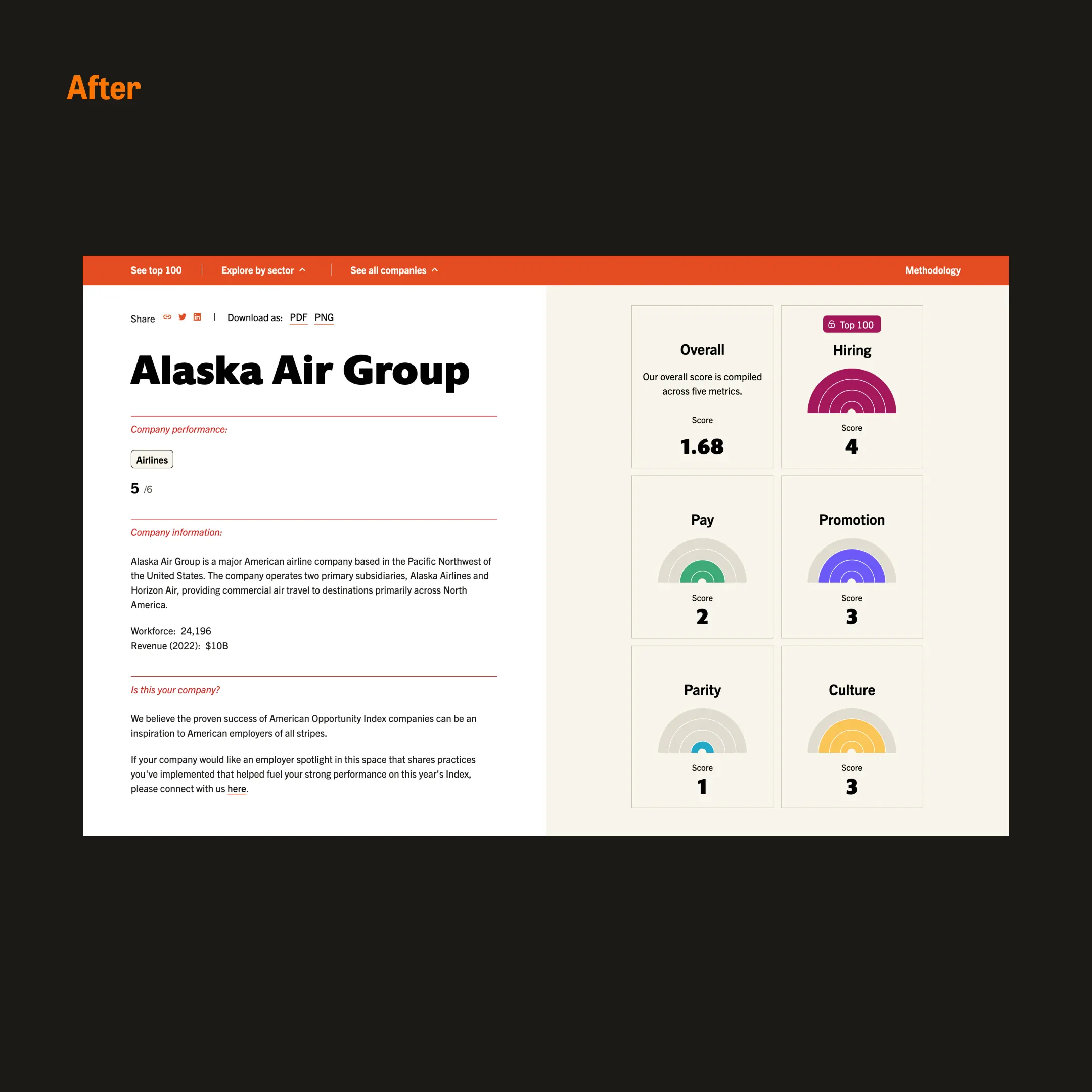
- A reimagined navigation system with clear content hierarchies
- Enhanced accessibility features, including optimized typography and color contrast
- An expanded color system supporting more diverse data visualization needs
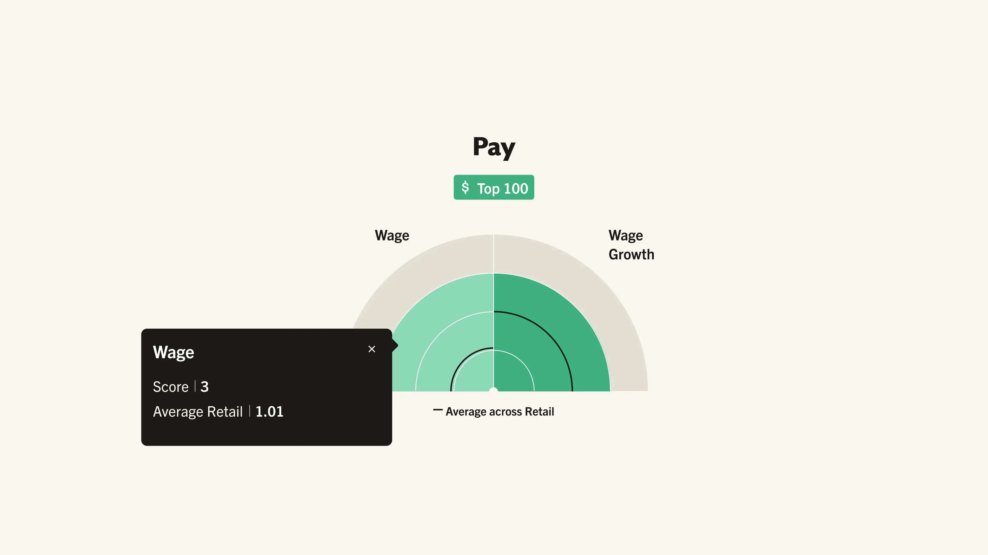
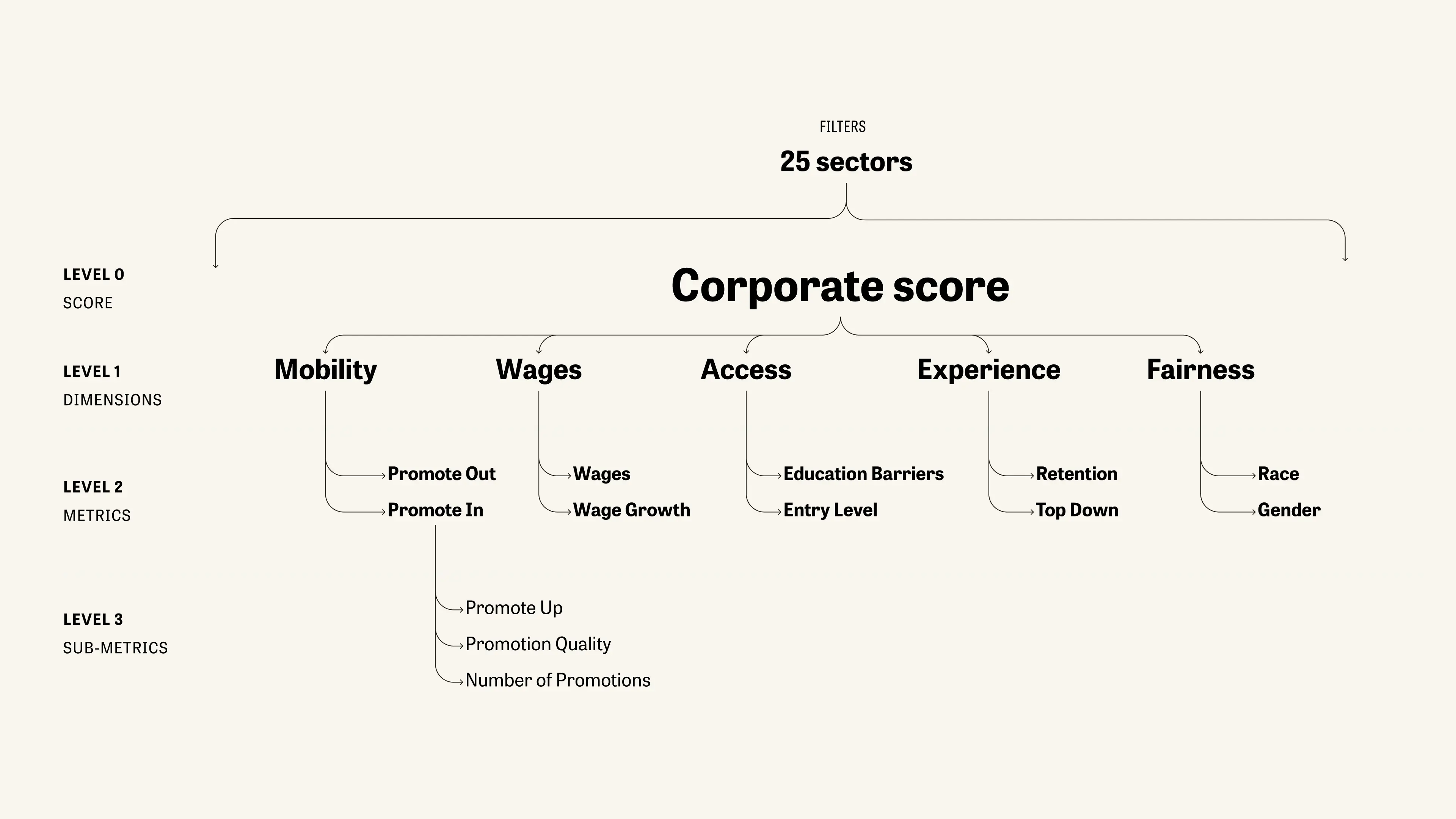
- Restructured data hub highlighting relationships between dimensions, metrics, and sub-metrics
- Implementation of familiar UI patterns to reduce cognitive load and allow users to navigate more easily both vertically through the different level of data and horizontal from company to company.
.webp)


.webp)
.webp)